Tuesday, July 14, 2015

THE ROASTROOM - AMSTERDAM


It all began more than 15 years ago when Michiel Deenik opened his first restaurant, Visaandeschelde, located in the Scheldeplein.  During these years, Visaandeschelde has become a household name in Amsterdam by offering the best seafood dishes and hospitable service in a bustling environment. In 2010, there was talk of introducing a new restaurant at the RAI Amtrium. The first restaurateur to come to mind was Michiel. Fast-forward to the present, THE ROAST ROOM has opened its doors!
THE ROAST ROOM occupies the ground floor and the first floor. On entering the restaurant, you will find yourself in THE ROAST BAR. The ROTISSERIE is located upstairs.
THE ROAST BAR is a brasserie style restaurant that is open for breakfast, lunch and dinner. From here you have a clear view of the heart of the establishment – the butchery.
The ROTISSERIE is the fine dining restaurant that is open for lunch and dinner. Inside you  see the magnificent open kitchen with its Australian Beech ovens, the broiler, the charcoal grill and the rotisserie, with a handmade tile wall by the Harlinger Tile Factory as a backdrop.


DESIGN
At THE ROAST ROOM, everything is about art: from the dishes being served to the interior with all its elements. The restaurant is designed by Studio Modijefsky and Studio Molen, who made it into a beautiful coherent place on every level: from the furniture, the bars and the butchery to the special lighting and the smallest bronze details. The two floors are connected by Ginger Blimp, one of Studio Molen's flagship lighting sculptures. The craftsmanship as well as the hospitality and open character of THE ROAST ROOM is represented in the interior, which has come into existence with great dedication.
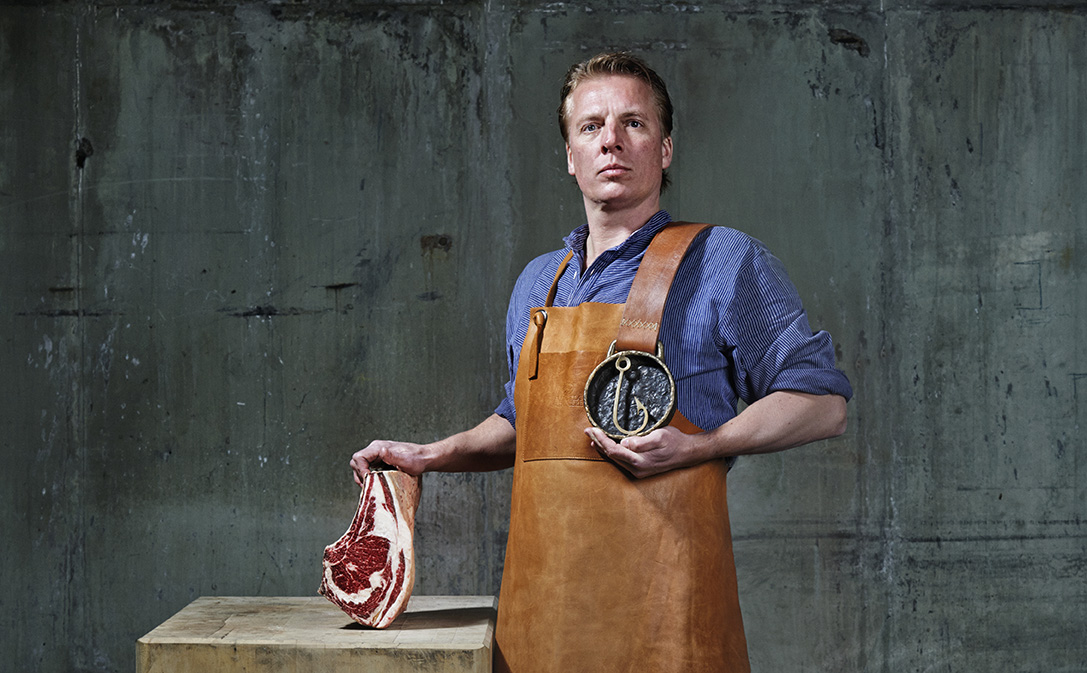
This presents me with an incredible opportunity to establish a new concept within walking distance of my current restaurant. At Visaandeschelde I can express my passion for seafood. At THE ROAST ROOM, I want to give free rein to my culinary aspirations with respect to meat. THE ROAST ROOM will be open every day and our guests will be able to expect the same quality and charm they have come to enjoy at Visaandeschelde.

http://en.theroastroom.nl/


Tuesday, May 26, 2015

EIJK - SUPERHEELS

EIJK-Super Heels


Jolanda van Eijk is al jaren ontwerper van kledingcollecties, maar besloot na een opleiding ambachtelijk schoenmaken haar hart te volgen. Nu is er Eijk, een nieuw Nederlands schoenenlabel met internationale allure. Kenmerkend voor de minimalistisch vormgegeven schoenen zijn de hakken, die door de toepassing van een optisch trucje hoger lijken dan ze in werkelijkheid zijn.
Jolanda van Eijk studeerde in 1997 af aan de Mode Academie Charles Montaigne in Amsterdam en werkte daarna als modeontwerper voor onder meer Tommy Hilfiger en Super Trash. Toen Super Trash haar vroeg een schoenenlijn voor haar label op te zetten, besloot Jolanda van Eijk een opleiding tot ambachtelijk schoenmaker in Nieuwegein te gaan volgen. Van Eijk: ‘Ik wilde niet alleen maar leuke mode items maken, maar echt leren hoe een schoen geconstrueerd wordt en hoe elke stap in het productieproces verloopt. Het maken van een schoen is echt millimeter werk. Hakken hadden vanaf het begin mijn specifieke interesse omdat ik zelf een fervent hakkendraagster ben en dus weet hoe vermoeiend het is om er de hele dag op te lopen.’ Gegrepen door het schoenmakers vak besloot van Eijk afgelopen jaar voor zichzelf te beginnen. Uitdaging was om een hak te ontwikkelen die vrouwelijk was, maar tegelijkertijd comfortabel.
Het resultaat vormt nu de signature van het merk: ‘Ik ben net zo lang gaan schaven en schuren tot ik een perfecte vorm gevonden had. Het is een niet doorlopend sleehakje geworden dat er, bezien vanaf de achterzijde uitziet als een naaldhak. Mijn schoenen ogen daardoor heel elegant en verleidelijk, zonder dat dit ten koste gaat van de draagbaarheid.’ Omdat Jolanda van Eijk met haar label vakmanschap wil leveren ging ze in de Italiaans regio Marche op zoek naar gepassioneerde Italiaanse handwerkslieden. Van Eijk: ‘Het is nog een heel gedoe om dat allemaal uit te zoeken. Als je gaat voor kwaliteit kan je het hele proces niet bij één producent onderbrengen. Ik werk nu met verschillende kleine familiebedrijfjes die ieder hun specialisme hebben. De leest, het patroon, het binnenwerk, de loop zool, de hakken… ieder onderdeel wordt ergens anders gemaakt en om uiteindelijk in één atelier geassembleerd te worden.’


Sunday, May 24, 2015

CASA LISSONI IN BROOKLYN LOFT DURING NEW YORK DESIGNWEEK

piero lissoni pairs design classics with locally-produced pieces in brooklyn loft

during new york design week 2015piero lissoni joins forces with a group of emerging brooklyn designers, architects and artisans — producing both independently and for leading brands — in the realization of the temporary ‘casa lissoni’. the italian designer has conceived the ultimate contemporary space for living and working, pairing classics with locally-produced pieces.


www.designboom.com
image by max zambelli

Tuesday, April 7, 2015

THE HUMANE SOCIETY OF UTAH - DOGS IN A PHOTOBOOTH

the humane society of utah recently enlisted photographer guinnevere shuster to come up with a creative and playful way to show the unique personalities of their adoptable dogs. in order to most closely capture the quirky character of each breed, shuster snapped photo booth portraits of each pooch in various positions and poses — blankly staring at the camera, shyly looking to the side or mid-bite. the square format photos of each dog, featured on the facebook of the humane society of utah, is coupled with a short description and details about their age and size for potential adopters. 


FOUND ON DESIGNBOOM

Monday, March 16, 2015

RESTAURANT CARLO E CAMILLA - MILANO


set within a historical sawmill, the restaurant and cocktail bar carlo e camilla in segheria, milan is established by celebrity chef carlo cracco and art direction given by tanja solci. the existing character of the building has been left majority untouched, the brick walls and the aged concrete walls have been left exposed, altogether adding to the overall industrial feel to the interior. intimacy and sharing is the main concept  highlighted by elements such as the use of two intercepting, communal tables placed at the center so diners can be aware of all aspects during their dining experience.
the building, segheria milano, is owned by tanja solci and in 1999, together with her father, they restored the factory from its previous post-war state for this restaurant. with solci for art direction, behind-the-scenes is led by carlo cracco and his team, cooking up cuisine that reinterprets traditional italian recipes with a contemporary twist.fusing italian culture into the choice of decor and tableware, a story is told through the setting. the industrial feel is refined by suspended vintage chandeliers, and during the evenings, dramatically light the space by casting shadows onto the table surfaces, creating an enchanting atmosphere. nicola fanti, the third partner of carlo e camilla, takes care of the management and ensures that the atmosphere and tanja’s design project is unique every evening.


segheria, via g.meda 24, milano
+39 02 8373963    

hello@carloecamillainsegheria.it


www.designboom.com

Monday, March 9, 2015

RESTAURANT NEVEL - AMSTERDAM (THE NETHERLANDS)

In January of this year Dutch chef Ricardo van Ede returns with his latest venture Nevel – Dutch for mist – has a waterfront location overlooking the IJ lake and is furnished with marble, whitewashed oak tables and white leather sofas by design firm Concrete. Van Ede’s food philosophy of seasonal, non-trendy fare is evident by way of the jars of piccalilli and chutney that fill the open shelving system. On Sundays, brunch guests are treated to a classic roast, while dinner patrons are asked to trust van Ede with the choice of a three to seven course set menu.

Westerdoksdijk 40
Amsterdam
Netherlands


PHOTO'S EWOUT HUIBERS

Tuesday, March 3, 2015

SINNERLIG - IKEA by STUDIO ILSE

SINNERLIG

Collection for IKEA, 2015
Studio Ilse designed a furniture, lighting and tabletop collection of around 30 items for IKEA, exploring natural materials and simple, useful forms that fit into everyday life. They are helpful, background pieces, not showstoppers. They worked with cork, ceramic, glass, seagrass and bamboo; tactile materials that appeal to them because they feel as good as they look. Studio Ilse worked with all aspects of the IKEA system and the many experts within it and developed the range together with the material, production, sustainability, design and logistics experts, making sure at every step that no part of the process was compromised. Ultimately their goal with the collection is in line with IKEA’s own mission: to make affordable design reach as many people as possible. The collection will be available in IKEA stores around the world from August 2015.


Saturday, January 31, 2015

MARSALA - COLOUR OF THE YEAR 2015 by PANTONE

Much like the fortified wine that gives Marsala its name, this tasteful hue embodies the satisfying richness of a fulfilling meal while its grounding red-brown roots emanate a sophisticated, natural earthiness. This hearty, yet stylish tone is universally appealing and translates easily to fashion, beauty, industrial design, home furnishings and interiors.

The Versatility of Marsala

  • Equally appealing to men and women, Marsala is a stirring and flavorful shade for apparel and accessories, one that encourages color creativity and experimentation
  • Flattering against many skin tones, sultry and subtle Marsala is a great go-to color for beauty, providing enormous highlight for the cheek, and a captivating pop of color for nails, shadows lips and hair.
  • Dramatic and at the same time grounding, the rich and full-bodied red-brown Marsala brings color warmth into home interiors
  • An earthy shade with a bit of sophistication, texture is the story in print and packaging. A matte finish highlights Marsala’s organic nature while adding a sheen conveys a completely different message of glamour and luxury.


http://www.pantone.com
http://www.designconnectioninc.com
http://homefurn.com

Friday, January 30, 2015

HUESO RESTAURANT - MEXICO


Located in the beautiful Lafayette Design District in Guadalajara, Jalisco, Mexico is the home and studio of Diaz Morales. The extraordinary modernist architecture setting from the 1940s in the beautiful Lafayette Design District in Guadalajara, Jalisco, Mexico serves as the perfect backdrop for Alfonso Cadena’s new concept restaurant “Hueso”. The restaurant name originates from the Spanish word “Bone”. 
The design approach takes the title literally, integrating architectural details, graphics and a design approach which plays up the skeletal ideaThe design approach for the building began with a creation of a double skin. The exterior of the building is covered in artisanal handmade ceramic tiles reminiscent of stitching and sewing patterns, protecting the inside layer which becomes more organic and full of texture. Inspired by the Darwinian vision and the name of the restaurant itself, the inside skin is covered with over 10,000 collected bones from animals and plants mounted on timber blocks. These were mixed with objects and cooking tools, all of which were assembled by urban visual artists.
The off-white colour palette and a collection of aluminium cast bones hang on the interior walls, while the exposed kitchen becomes a display for the guests – the bar is the only partition between the culinary artists and the main table. 


http://www.yellowtrace.com.au